When the original Pokémon card game debuted in Japan in October 1996, the franchise was not an international media empire. The animated television series did not exist, plush merchandise had not yet hit store shelves, and color assets were practically nonexistent outside of a few promotional sketches.
To produce card illustrations for the initial Expansion Pack, Creatures Inc. hired a 25-year-old freelance illustrator named Mitsuhiro Arita. His task was to take monochrome Game Boy sprites and turn them into full-color, believable creatures.
Among the assignments on Arita's desk was Charizard.
Working Without Reference Material
Modern card artists receive comprehensive style manuals, three-dimensional digital turnarounds, and pantone-precise color guides for every creature. In early 1996, Arita worked under entirely different conditions.
Creatures provided him with photocopies of Ken Sugimori’s early black-and-white line art and the pixelated, 56-by-56-pixel sprite sheets from the Game Boy titles *Pocket Monsters Red* and *Green*. Because the original Game Boy display was limited to four shades of gray, Arita had to extrapolate how light and flame interacted with the creature's skin.
- The dragon’s physical bulk came from real-world anatomy; Arita studied lizards and dinosaurs to figure out how heavy thighs and clawed feet would balance a massive torso.
- The wings were structured like those of a bat, with visible leathery membrane tension spanning the finger bones.
- The fire emanating from the mouth was painted not as a stylized cartoon blast, but as an expanding plume of superheated gas that casts directional light across the monster's chest.
Sugimori’s brief was direct: the cards needed to look like living, breathing organisms rather than flat cartoon icons.
Physical Gouache on Paper
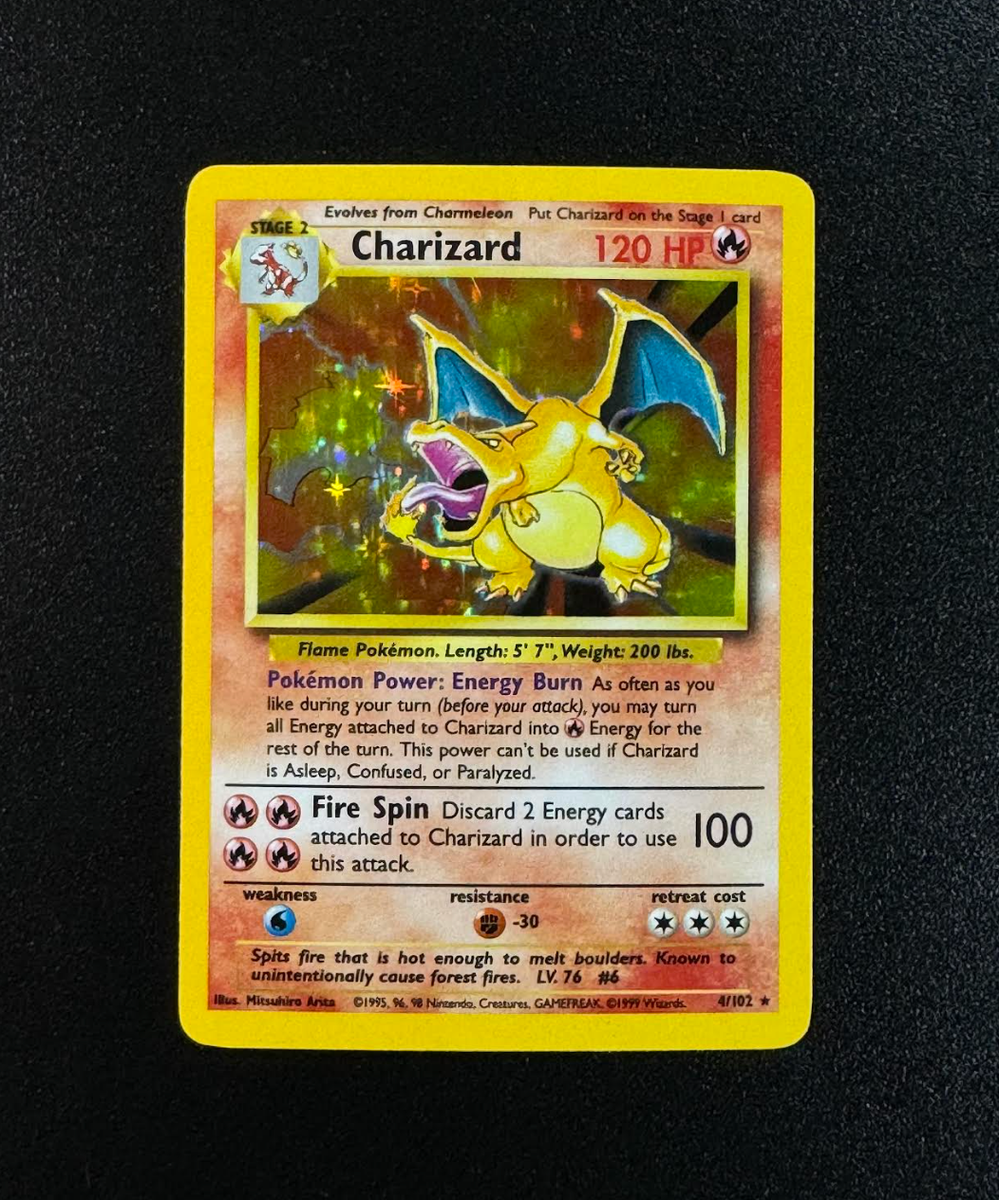
Unlike the vector files and digital tablets standard across contemporary card design, Base Set Charizard was executed entirely on physical paper using acrylic gouache.
Arita painted Charizard in a low, coiled crouch. By placing the creature's head forward and opening its jaws toward the viewer, he maximized the claustrophobic space of the card's rectangular art frame. The background was left abstract—a swirling red and yellow vortex of thermal energy—deliberately focusing all visual weight on the creature's biological mass.
The original Japanese card, designated No. 006, carried no rarity symbols on its earliest unnumbered printings. When Wizards of the Coast adapted the set for Western markets in January 1999 as Base Set #4, Arita's gouache painting was married to English holographic foil, cementing it as the premier grail of the hobby.
Three Decades at the Drafting Table
Arita has remained an active contributor to the Pokémon Trading Card Game since that first 1996 assignment. He has illustrated over 600 unique cards across three decades, returning to Charizard multiple times—including celebratory prints like Charizard from 2002's *Expedition Base Set* and the Tag Team GX pairings of the Sun & Moon era.
Even with modern digital rendering at his disposal, Arita continues to favor traditional techniques and direct observational drawing. What began as a blind translation of low-resolution pixels produced the visual benchmark against which every subsequent fire-type card has been measured.