When Yu-Gi-Oh! launched as a physical trading card game, it held a visual style distinctly different from established tabletop games. While traditional fantasy card games relied on painted artwork from a wide pool of commercial illustrators, Yu-Gi-Oh!’s early visual language came directly from a single manga creator: Kazuki Takahashi.
Takahashi’s original ink drawings, published in the pages of Weekly Shonen Jump beginning in 1996, were adapted straight into the first official cards produced by Konami. That direct pipeline from comic page to card frame gave the game an immediate, recognizable identity that anchored its global rise.
From Manga Frame to Card Frame
In the earliest sets of the Japanese Official Card Game (OCG) and the subsequent international Trading Card Game (TCG), iconic monsters did not receive newly commissioned artwork from outside studios. Instead, Konami visual designers cleaned up and framed existing panels drawn by Takahashi for the manga story arcs.
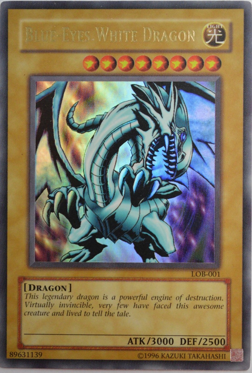
Cards such as Blue-Eyes White Dragon, Dark Magician, Summoned Skull, and the individual pieces of Exodia the Forbidden One were taken directly from Takahashi’s sequential art. His drawing style was characterized by heavy black inks, sharp geometric line work, and dramatic foreshortening.
Unlike traditional fantasy illustrations that emphasized environmental depth and soft lighting, Takahashi’s monster designs prioritized silhouette, high-contrast shading, and immediate readability. The sharp edges of dragon wings and the exaggerated proportions of fiend armor were designed to pop on a low-resolution manga page, making them perfectly suited for shrinking down into a small card window.
Adapting Art for International Markets
As Konami prepared to bring the card game to North America and Europe in 2002, Takahashi’s original artwork encountered standard international publishing guidelines. Several early cards required localized modifications to comply with Western retail standards regarding religious symbolism, graphic imagery, and sharp weapons.
The most famous modification occurred with Monster Reborn. In Takahashi’s original manga and the Japanese OCG printing, the card illustration features an Egyptian Ankh—the ancient symbol of life. For the TCG release in 2002, Konami altered the art to feature a stylized blue key with a glowing gem and crossguards, removing the explicit historical religious iconography while preserving the concept of revival.
Other early cards underwent similar visual transformations. Mystical symbols were altered, horns and pentagrams were modified on cards like Fiend Comedian and Spellbinding Circle, and exposed weaponry was softened. Despite these regional changes, the underlying line work and dynamic posing remained unmistakably Takahashi’s.
An Enduring Design Legacy
As the Yu-Gi-Oh! TCG expanded over decades, Konami transitioned toward digital line art and a broader roster of freelance illustrators. Modern card art often features dense background effects, vibrant digital gradients, and complex mechanical designs.
Takahashi’s signature visual hallmarks—sharp silhouettes, heavy ink lines, and Egyptian mythic motifs—remain the baseline aesthetic against which all modern Yu-Gi-Oh! cards are drawn.
Takahashi continued to hand-draw special variant artwork for key anniversary releases until his passing in 2022. Cards bearing his direct signature imprint, such as anniversary prints of Dark Magician and Blue-Eyes White Dragon, stand apart from standard set printings due to their organic line weights and painterly color palettes. For collectors, these cards represent the direct connection between the card game and the illustrator who drew it into existence.